Heatmapping and Other Ways Data Collection Can Improve Your Banner Design
Let’s start with a simple analogy.
A vendor selling apples and oranges received his idea from a neighbor who told him the fruits’ markets are soaring in demand.
However, the vendor only has a limited budget to purchase his initial inventory.
He decides to purchase a small quantity of both fruits.
After he sold his first batch of fruits, he noted that the oranges sold faster than apples for the particular month.
He performs the same experiment the next month and finds that apples sold faster compared to oranges during that period.
After a year, the vendor invests in apple and orange fruit inventories exclusively during a given month.
The vendor’s data collection and precise analysis had helped him make confident decisions and turn a profit in less than a year.
Indeed, data’s power comes from its objectivity.
Internet marketers value data collection processes to build better-performing sales funnels.
Landing pages, the starting point of any sales funnel, values its banners and other imagery to grab attention and provide information in the shortest time possible.
Today, numerous methods of banner data collection exist. These are the following:
Heatmapping
Humans are creatures of habit.
This explains their likeliness to follow or even create patterns.
As the most objective part of the human body, the eyes take everything as they see in a literal manner (because there is no other way!).
However, the human brain is persistent in finding patterns, which makes it predictable.
Creative Bloq points out that the human eye locks itself to anything that moves very quickly.
Citing a study from 99Designs, it found that the human eyes move in an F and Z pattern.
According to the mentioned study, users often skim through a website or image’s text.
Because their websites are text-heavy, CNN and New York Times’ websites use the F-pattern.
Meanwhile, branding websites use the Z-pattern to introduce a simpler yet visual-friendly site design that does not introduce any obstructions to the viewing pattern of the audience.
These two postulates work effectively for almost any website with a similar archetype.
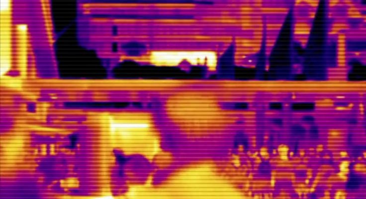
This information was conducted using a ‘heatmapping’ analysis.
This survey method works in different ways.
SurveyMonkey’s process uses a questionnaire that functions similar to a mobile chat bot. The application presents an image to the surveyed asks them to click on certain elements based on the question the surveyor asks.
According to MockingFish, which is another heatmapping tool, their data collection comes from placement of various elements on a website.
The placement of trackers allows the application to collect clicks from certain elements and then highlights them in a “hot” and “cold” diagram for effective analysis.
A/B and Multivariate Testing
The scientific method uses multiple steps to resolve problems.
A hypothesis is an early educated guess based on previous results from earlier research regarding the same issue.
To test a hypothesis, the scientist will proceed with an experiment to collect empirical evidence usually through a controlled environment or subject.
The same is true when it comes to performing A/B and multivariate tests.
You can test the different combinations of the different elements of your landing page, image, or banner.
However, A/B tests only involve two controlled environments or variables. Multivariate testing involves multiple combinations of elements to discover optimum-performing results.
The two have advantages and disadvantages.
A/B Testing: Only two cases can simultaneously be examined.
However, it maximizes the amount of traffic your website uses to achieve optimal results.
It is also less time and resource-consuming provided the smaller number of test cases.
Multivariate Testing: Provides an accurate picture of adjustments to perform by testing all combinations as possible.
However, it can be time and resource consuming.
Because it can split web traffic if you perform multiple combination tests, this may affect the final test results.
Desaturation
Centered on image-based analytics without much empirical data, the last three image analytic practices focus mainly on improving for a better user experience.
According to Team Treehouse’s blog, there are three ways to measure and improve an image’s performance.
One of them is through desaturation.
The removal of color saturation makes the image black and white.
The test allows the designer to find value versus color contrasts.
Value-based contrasts show the difference between light and dark.
Some elements in an amazing design can disappear upon desaturation.
The purpose of the test is to highlight the changes in value.
All audiences, which are humans, are sensitive to changes in contrast value than color.
The value of light and dark contrasts allows you to control areas to highlight, which can work to your advantage.
Contrast in value makes it possible for color-blinded audiences to create visual hierarchies without much difficulty.
Collecting and testing contrast-value improved images can make it easier and faster to find the optimum-performing results you need for a banner quickly.
Blur Comparison
This is another test Team Treehouse uses to improve its designs, it is also one of the easily dizzying.
However, it allows designers and marketers to look at the color mix saturation and determine the elements in their landing page or banners that are quickly noticeable.
Complemented by a heatmapping examination, you can distribute elements in your design to create different design appeals.
You can also improve accessibility by removing visual obstacles disabling the image from creating a seamless experience.
The test’s basis is the behavior of first-time visitors.
Most will scan the headers and images rapidly from start to finish.
If you imagine viewing the audience’s eyes and slowing it down, you might only see image blurs.
Now, by improving those images’ visibility even when blurred, you can focus the audience’s attention to the element at will.
The latter is an important design aspect especially if you want to grab the viewer’s curiosity within a few seconds.
Upside-Down Examinations
It sounds silly to turn your entire project upside-down and turn your head to make sense of the picture.
However, the purpose of Team Treehouse’s third image test is to identify any element composition problems.
The test’s basis is to ensure the two sides of a banner or image achieve balance when it comes to the number of elements, colors and contrasts the artist has introduced.
A symmetrical image is appealing to the human eye.
If you intend to use this idea to create imbalance and make certain elements in your composition quickly noticeable, then you can create banners that position certain elements you need users to notice and remember first before the others.
However, balancing is a great user experience improving practice because creating symmetry introduces a harmonious and seamless viewing experience for any landing page or viewer.
Five Ways Data Collection Improves Your Banner’s Overall Performance
1. Identifying Best Practices
Internet marketers focus on pictures that can tell its story in the shortest possible time.
All of the technical and aesthetic examinations mentioned above ensure the images’ stories are concise and easy to understand in less than a minute.
They will record the standards of effective image storytelling through landing pages, images, or even simple banners as established best practices.
You can think of best practices as the “Standard Operating Procedure” most businesses have to achieve excellent quality outputs in products or services.
For your company, every normal day is similar to a multivariate examination because each of your employees function differently.
Recording their performance allows you to establish standards, which contribute to growth through the creation of realistic and achievable milestones.
You improve the quality of your landing pages and banners for sales funnels through the proper analysis of cumulative data.
In fact, proper data analysis allows you to improve your assets and even an entire digital marketing campaign.
2. Optimizing Technical Image Properties
Whether you’re creating an image for your page’s Facebook cover photo or crafting a new landing page banner, these data collection tests help you find technical aspects that become the “hard” standard for image outputs.
Hard standards are essential especially if you wish to streamline and automate the process for your employees.
For example, recording the Facebook cover photo dimensions of 820 by 462 pixels allows designers to create multiple templates.
However, this example is not enough to speed up the design process.
Therefore, using the aesthetic examinations helps companies identify the right visual hierarchy, shapes, colors, and other small factors that will have an impact on the image’s final design.
In the case of landing pages and website best practices, images must also load quickly while appearing in the highest resolution possible.
Because all hosting and website assets differ in size and capability, finding that “sweet standard” for minimizing and compromising the image’s file size for the quickest loading time involves technical testing.
Many marketers have their established image optimization practices based on years of testing and analysis.
You can use these information as starting points to create your respective quality standard.
3. Improved Engagement and Asset Performance
Heatmapping finds areas audiences often tap or rest their mouse pointers when viewing a particular page or image.
In fact, survey-based heatmapping collects precise data on the audience’s eyes’ viewing path upon seeing the landing page or image.
The F and Z viewing patterns are as true as photography’s “Rule of Thirds.”
However, hard data is more useful in determining the right course of action because it is objective and realistic.
Seeing the hottest and coldest spots of an image helps designers formulate new ideas that maximize these “hot” spots to position certain elements such as CTA buttons or thoughtful messages that urge sales.
In this light, data collection is a crucial key to improving the asset’s engagements provided the viewer’s behavior is as the data predicts (which is highly likely in most cases).
Because banners play a huge role in landing pages, modifying them with data-backed decisions makes them more efficient, too.
4. Realistic and Measured Milestones
Data’s objectivity allows businesses to predict their asset’s performance with little margin for error.
For example, if an optimized asset is improving smoothly for three months, the fourth month should not be any different unless a minor part of the asset was change.
Collecting performance data from assets such as banners and images makes it easier to create milestones based on data-backed predictions.
For most businesses, certainty with regards to performance and return on investments matter immensely.
Therefore, using data to have banner designers and image producers create the optimal content required for any digital marketing campaign, sales funnels, and other visual-based communications saves time and resources from trial and error.
In fact, business with plans for visual-driven campaigns can use the standards published by their competitors.
Imitation is indeed a sincere form of flattery, but it also helps create relevance and ensure that you can achieve your milestones (because they are realistic).
5. Confident Decision-Making
In the earlier analogy, the fruits vendor did not know whether apples or oranges sold better in some months compared to others.
After a year, he knew which fruits sold better during different months.
His one year of data collection by noting the buyer number of both fruits per month in his first year allowed him to make precise decisions and maximize his return on investments the following year.
It might sound impossible that companies can identify their best practices for images, banner design, and even overall marketing campaigns, by collecting data.
However, through careful experimentation with precise objectives and an excellent analysis of the information ensuring all conclusions are relevant to the situation, data can help businesses make the right calls from design to marketing and branding action.
Conclusion
Indeed, data can improve your banner’s overall design. Heatmapping is an excellent process of gathering data and improving your existing design to unlock its full potential.
Apply the principles of data everywhere, and you can definitely make the best decisions in any aspect of your business.
Data allows you to save time and money on asset development while maximizing their potential.
Through information and proper analysis, you can also establish the best practices your business needs and cuts the time of having to govern and make design decisions when data can do it for you.